
Zorg Vooruitopen_in_newVisit website
8 projects
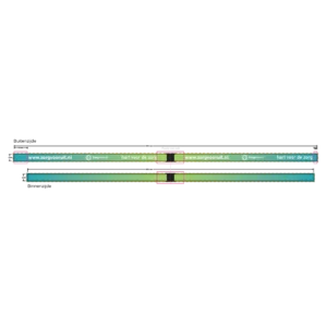
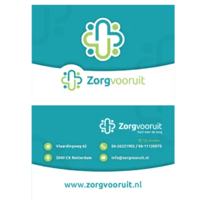
Zorg Vooruit wanted to thank its care staff for their effort during the corona crisis. That staff is employed through the agency and works spread across institutions.
For them I designed thank you cards and lanyards that were sent out. The lanyard holds the keys and passes they use to enter the institutions, so the thank you goes along on every shift.
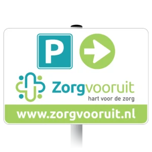
Since the office move, visitors to Zorg Vooruit regularly had trouble finding the car park. So I was asked to design a parking sign.
The icons on the sign follow the house identity of the agency. That makes the sign visibly part of the building.

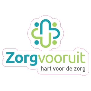
The windows of the Zorg Vooruit office were still empty after the move. On glass a logo falls apart into loose letters, because the background runs straight through it.
So I put a white outline around the logo. It now sits on the window as one whole instead of as loose letters.
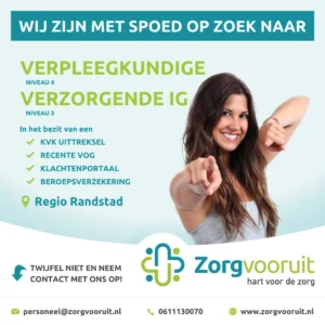
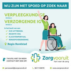
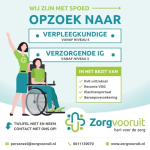
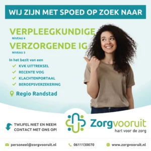
Most applications at Zorg Vooruit come in through the social channels. To recruit self-employed staff I designed a series of posts for that.
In the end I put it into a Canva template. Staff at the agency have been making their own posts since, within the house identity.
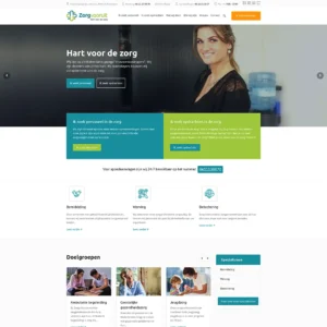
Zorg Vooruit is a staffing agency for self-employed care workers. The agency brings care institutions and independent carers together.
The website I got to build for them in WordPress. Carers and care institutions both find what they are after there.
After Zorg Vooruit moved office the business cards carried an address that was no longer right. So new ones were needed.
Next to a general version I designed variants for the management, with their own details on them.
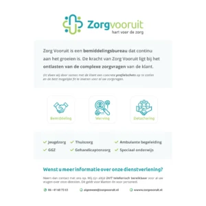
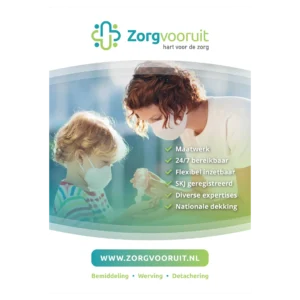
Zorg Vooruit wanted to win new partners and assignments. This acquisition flyer I designed for that.
It briefly states what the agency does and what it can mean for its partners. The flyer is meant to be left behind after a first conversation.
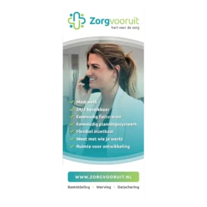
Zorg Vooruit had introduced the slogan Hart voor de zorg. One of my first jobs for the agency was to make that slogan visible.
For them I designed a rollup banner with the slogan as the starting point. The banner was the first of the series of identity pieces that followed.