
Corporate Identity Carriers
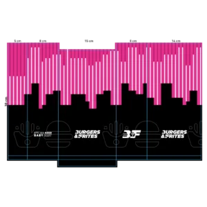
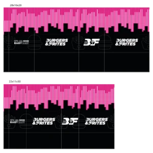
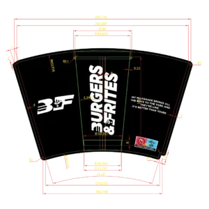
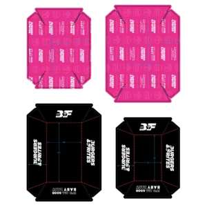
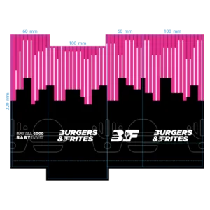
After the logo redesign the rest of the place had to follow. The new look I rolled out onto everything a customer gets in their hands.
So I designed the packaging, the bags, the cups, the trays and the placemats. Everything carries the new look I made for them.
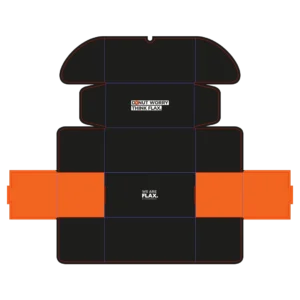
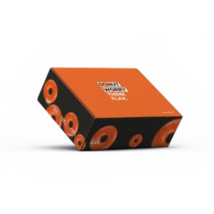
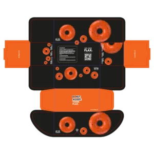
For marketing agency Flax.Marketing I designed a donut box. The box serves as a corporate gift and holds five donuts.
I designed the box so it folds shut without any glue. That way it can be folded and filled on the spot.
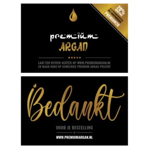
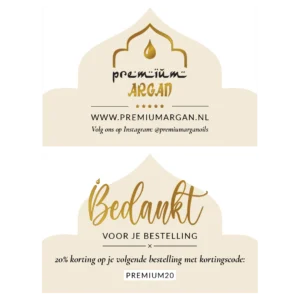
Anyone who orders from Premium Argan gets a personal thank you card with it. That card I designed for them.
The format is that of a business card. That way it goes into the box on its own, next to the instruction leaflet I also designed.
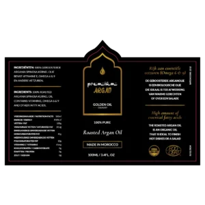
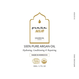
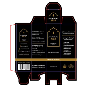
I was asked to improve the designs of the Premium Argan bottles and packaging. Those were not made by me and the client wanted to keep the same style.
So the challenge was improving inside a design that already existed. The bottles and the packaging I revised with that style as the frame.
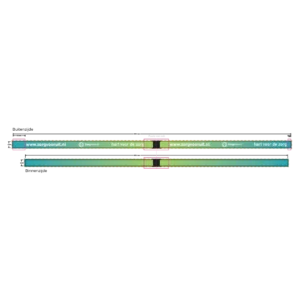
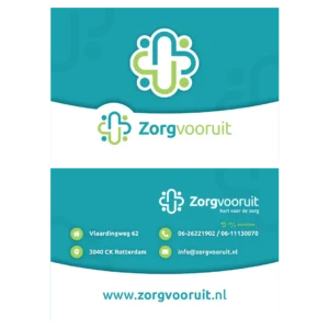
Zorg Vooruit wanted to thank its care staff for their effort during the corona crisis. That staff is employed through the agency and works spread across institutions.
For them I designed thank you cards and lanyards that were sent out. The lanyard holds the keys and passes they use to enter the institutions, so the thank you goes along on every shift.
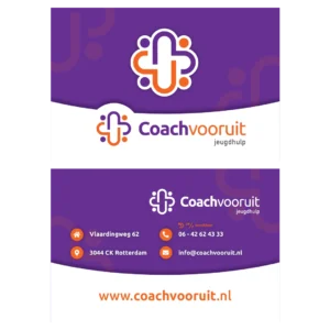
Coach Vooruit helps young people who have fallen between the cracks. For the organisation I designed the business cards.
The cards follow the house colours of the company. That puts them with the leaflet and the roadmap I made for them.
After Zorg Vooruit moved office the business cards carried an address that was no longer right. So new ones were needed.
Next to a general version I designed variants for the management, with their own details on them.
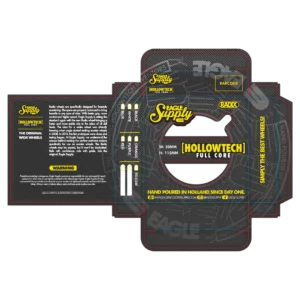
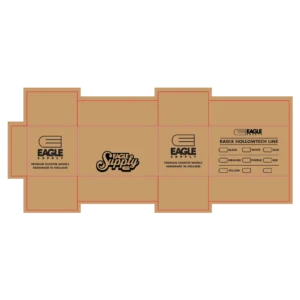
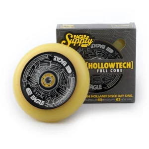
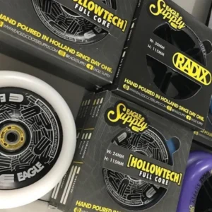
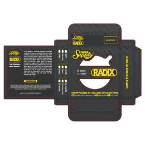
Eagle Supply and Addict Scootering are international brands of Dutch origin. They have made the most iconic stunt scooter wheels for years.
I was asked whether I could design packaging for a new series of wheels. The box I designed so the colour of the wheel is visible right away through a cut out. That was not the case with the previous packaging.
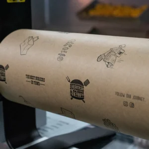
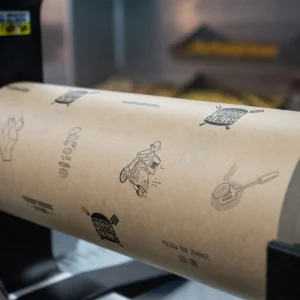
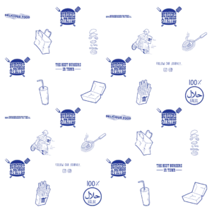
The burgers and wraps at Burgers & Frites are wrapped in paper to keep everything together.
The pattern on it I designed with the illustrations from the identity. That puts it in line with the rest of the design work I made for this place.
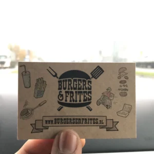

The business card of Burgers & Frites I designed within the identity of the place. The same illustrations come back on the wrapping paper and on the windows.
Printing them on cardboard was my idea. That gives the cards a handmade look.
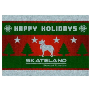
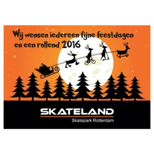
Every year the skatepark sends out Christmas cards. The designs I matched to the house colours of Skateland.
One card shows all four sports that use the park. The other shows Doekie, the dog that always walks around there loose, drawn as if the design were knitted from wool.