
Logo designs
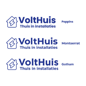
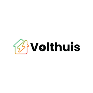
Volthuis installs home batteries and advises on energy use in the house. For them I designed the mark and the wordmark in Illustrator.
The mark is a house with a lightning bolt, and in the wordmark that bolt sits in the o. The house runs from green to red, like a battery from full to empty.
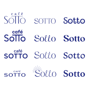
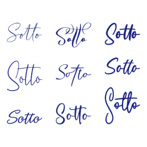
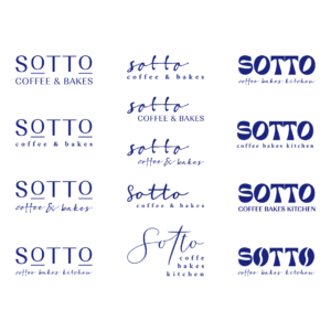
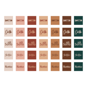
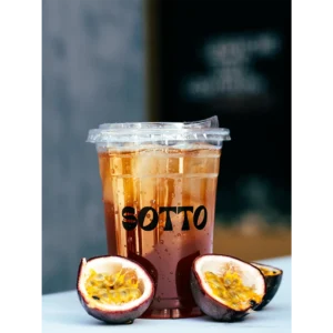
Sotto is a café and bakery in Utrecht. For the opening I designed the logo in Illustrator, the first of three jobs.
For the wordmark I worked out a number of directions, from a straight capital to a written letter. It became a solid shape with round letters, which I then put on colour.
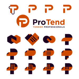
ProTend connects companies with professionals in tendering and procurement. For them I designed the mark and the wordmark.
The P contains a folded corner, which refers to the documents a tender consists of. There are versions of the mark for a light and a dark background.
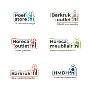
HMDH supplies interiors for offices, shops and hospitality at an affordable price. The range sits across five web shops, from barkruk.nl to poefstore.nl.
For those shops I designed a set of logos. Each shop has its own, and together they line up with each other.
After the success of the logo I designed in 2015, eight years on it was time for a new look. Together with the owners I worked on that.
The emblem I revised and then rolled out onto the packaging and the banner. That brought the whole place into the new style in one go.
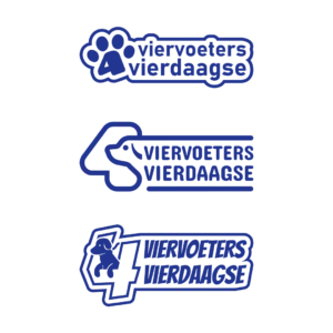
At the Viervoeters Vierdaagse you walk 20,000 steps with your dog for charity. The four day event ran from 1 to 4 November 2021 and the proceeds went to Hulphond Nederland.
I was asked to design a logo for it. Because the four is the most important element in the name, I brought it back into the emblem.
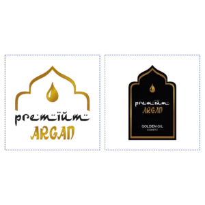
The Premium Argan logo fell away on small surfaces. On a label and as a profile picture little of it was left.
The logo I simplified while keeping all the important elements. It now fits inside a circle as well, so it works as a profile picture on the social channels.
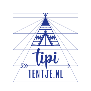
Tipi Tentje supplied me with a sketch of the logo they wanted. That sketch I worked out on a grid in Illustrator.
I used the grid so the proportions of the elements in the logo line up. That fixes how the logo is built up instead of leaving it to the eye.
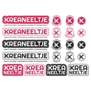
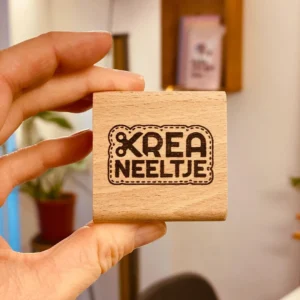
Kreaneeltje offers different kinds of creative workshops. I got to design a new logo for her that shows that creativity at once.
For that I used the scissors as the emblem, with a cutting line around the logo. That gives you an idea straight away of what she does, and the logo stays usable in different shapes and sizes.
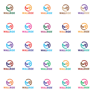
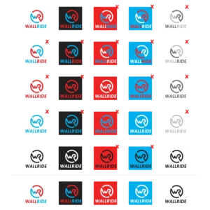
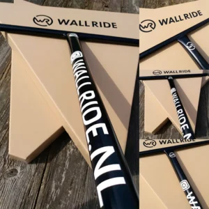
Wallride makes wall mounts for hanging up a surfboard, snowboard, skateboard or scooter. They also produce scooter bars and parts.
The logo I designed in several stages. That brought me to a result the client and I are both happy with.
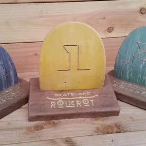
Rol je Rot is an annual skateboard contest for Dutch riders under sixteen. I was asked to design a logo for it.
The logo I put down fairly quickly. It has been used for the event since 2015.
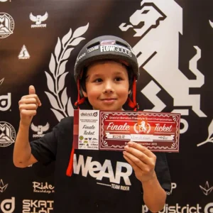
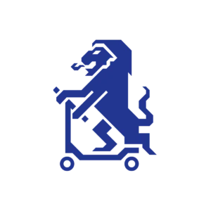
The Benelux stunt scooter championship is held at Skateland every year. For this tournament I designed the emblem.
The lion on the scooter stands for the Netherlands. The emblem has been in use since 2015 and is now recognisable for the event.
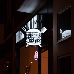
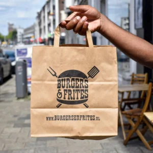
I was asked to design a new logo for Burgers & Frites, a burger place in Rotterdam South. Several concepts I presented to the owners.
After that I designed a number of iterations. It became a recognisable logo that has kept growing with the business since 2015.