
Illustrator
51 projects
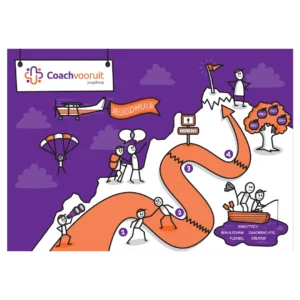
The Coach Vooruit programme runs in four phases. I visualised that process for them to make the programme clear to young people.
The roadmap is full of metaphors about the programme. The illustration makes explaining it simpler, so a young person better understands what is coming.
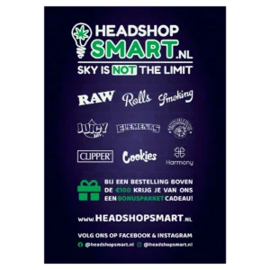
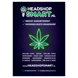
Headshop Smart is a web shop with cannabis related products. For them I got to design a flyer, a sticker and a business card.
The flyer was printed 20,000 times. After that it was handed out around the Rotterdam region.
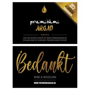
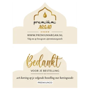
Anyone who orders from Premium Argan gets a personal thank you card with it. That card I designed for them.
The format is that of a business card. That way it goes into the box on its own, next to the instruction leaflet I also designed.
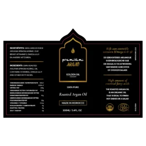
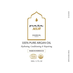
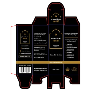
I was asked to improve the designs of the Premium Argan bottles and packaging. Those were not made by me and the client wanted to keep the same style.
So the challenge was improving inside a design that already existed. The bottles and the packaging I revised with that style as the frame.
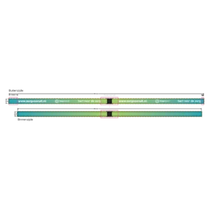
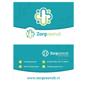
Zorg Vooruit wanted to thank its care staff for their effort during the corona crisis. That staff is employed through the agency and works spread across institutions.
For them I designed thank you cards and lanyards that were sent out. The lanyard holds the keys and passes they use to enter the institutions, so the thank you goes along on every shift.


The Premium Argan logo fell away on small surfaces. On a label and as a profile picture little of it was left.
The logo I simplified while keeping all the important elements. It now fits inside a circle as well, so it works as a profile picture on the social channels.
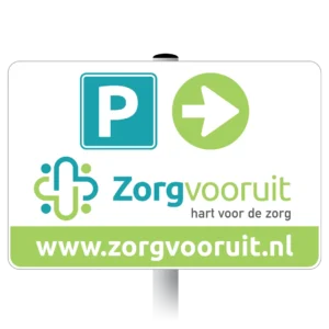
Since the office move, visitors to Zorg Vooruit regularly had trouble finding the car park. So I was asked to design a parking sign.
The icons on the sign follow the house identity of the agency. That makes the sign visibly part of the building.
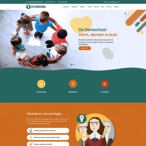
De Denkschool is a group of philosophers offering philosophical projects to schools and companies. For them I took the website in hand.
I gave the site a new look and feel. The existing content stayed, so the work was in the design and not in the structure.
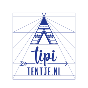

Tipi Tentje supplied me with a sketch of the logo they wanted. That sketch I worked out on a grid in Illustrator.
I used the grid so the proportions of the elements in the logo line up. That fixes how the logo is built up instead of leaving it to the eye.
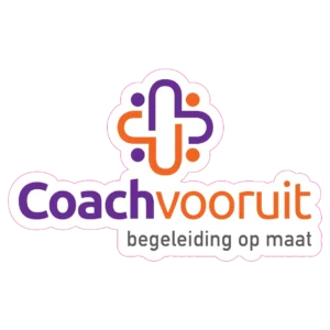
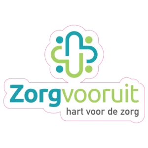
The windows of the Zorg Vooruit office were still empty after the move. On glass a logo falls apart into loose letters, because the background runs straight through it.
So I put a white outline around the logo. It now sits on the window as one whole instead of as loose letters.
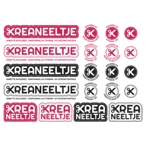
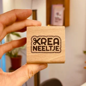
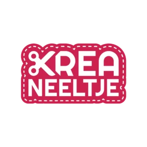
Kreaneeltje offers different kinds of creative workshops. I got to design a new logo for her that shows that creativity at once.
For that I used the scissors as the emblem, with a cutting line around the logo. That gives you an idea straight away of what she does, and the logo stays usable in different shapes and sizes.
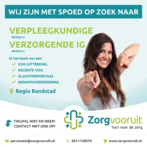
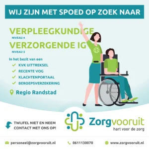
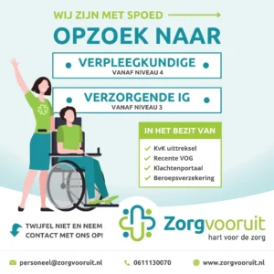
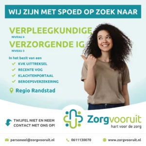
Most applications at Zorg Vooruit come in through the social channels. To recruit self-employed staff I designed a series of posts for that.
In the end I put it into a Canva template. Staff at the agency have been making their own posts since, within the house identity.
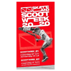
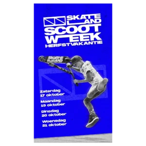
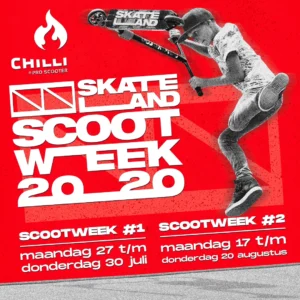
To promote Scoot Week at Skateland Rotterdam I designed a series of social media posts.
The posts were shared on the Instagram account of the skatepark. I also made the designs for the Instagram Stories of the event.
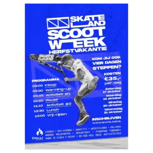
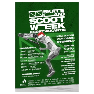
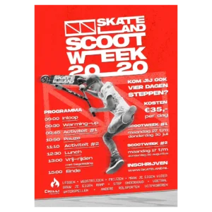
Scoot Week is an event with activities for children, held at Skateland. It went well enough that more editions followed.
For those editions I got to design the flyers and the social media posts. Every edition got its own announcement that way.
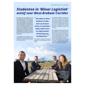
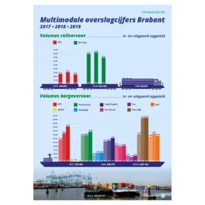
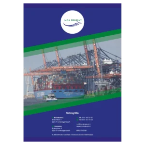
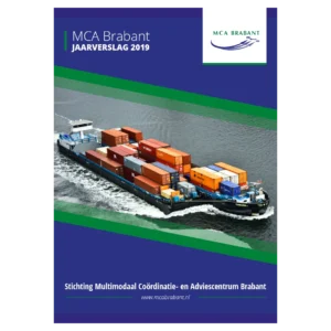
MCA is the Multimodal Coordination and Advice Centre Brabant. In their annual report they publish the statistics and figures reached that year.
I got to lay out the 2019 annual report for them. Figures make up most of a report like that, so that is where the work in the layout sat.