
Illustrator
51 projects
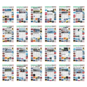
For De Binnenvaartkrant I laid out the paper for a year and a half, edition after edition. I did that together with the editorial and the sales department.
Next to laying out the paper I was responsible for the advertisements. The other printed material of the paper I laid out as well.
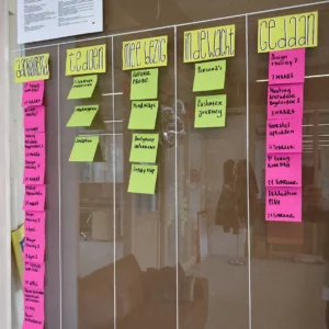
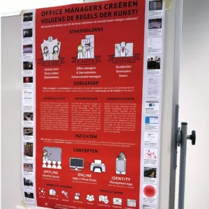
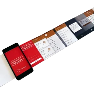
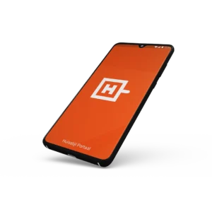
My graduation project for CMD was about brand identities and how they are guarded. I carried out the research together with visual communication agency Uit de Kunst! and the Schieland en de Krimpenerwaard water authority.
In an organisation like that many people work with the same identity. With this project I completed my studies at Rotterdam University of Applied Sciences.
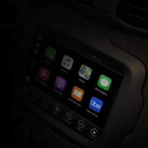
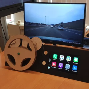
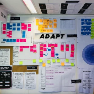
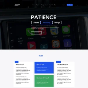

For the User Interface and User Experience Design minor our team was challenged by design studio Hike One. The assignment was to translate an existing mobile app to Android Auto or Apple CarPlay.
We chose to port the Uber Driver app to CarPlay. Within the Adapt team I was the visual designer.
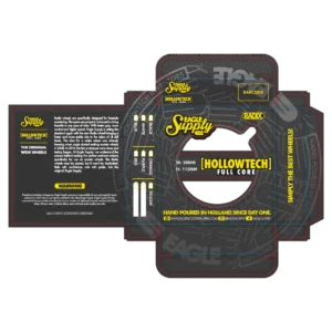
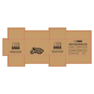
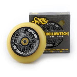
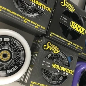
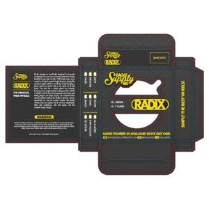
Eagle Supply and Addict Scootering are international brands of Dutch origin. They have made the most iconic stunt scooter wheels for years.
I was asked whether I could design packaging for a new series of wheels. The box I designed so the colour of the wheel is visible right away through a cut out. That was not the case with the previous packaging.
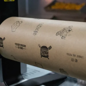
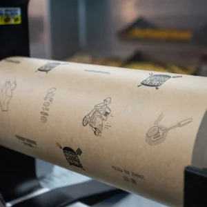
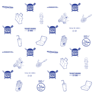
The burgers and wraps at Burgers & Frites are wrapped in paper to keep everything together.
The pattern on it I designed with the illustrations from the identity. That puts it in line with the rest of the design work I made for this place.
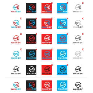
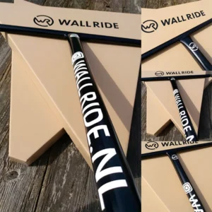
Wallride makes wall mounts for hanging up a surfboard, snowboard, skateboard or scooter. They also produce scooter bars and parts.
The logo I designed in several stages. That brought me to a result the client and I are both happy with.
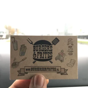

The business card of Burgers & Frites I designed within the identity of the place. The same illustrations come back on the wrapping paper and on the windows.
Printing them on cardboard was my idea. That gives the cards a handmade look.
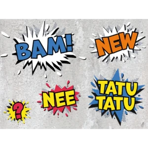
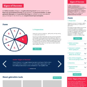
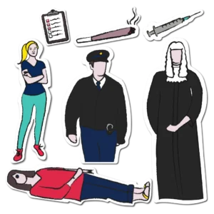
An internship at Buro BRAND did not stop at drawing. Next to the illustrations I made the imagery for an animation and designed a website in Sketch.
I also gave drawing workshops at ING and Rijkswaterstaat. There I stood in front of a room of people who were going to draw themselves.
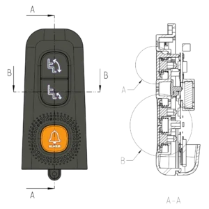
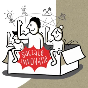
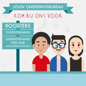
Next to the many drawing jobs at Buro BRAND I also worked on print. With print it comes down to formats, margins and delivering the files.
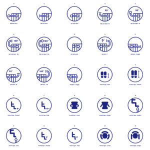
Among other things I designed icons used in a modern stairlift system. Icons are the smallest form of visual communication there is.
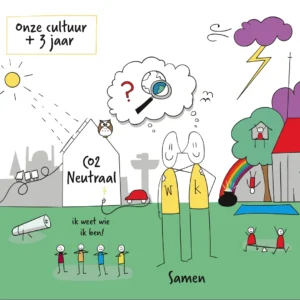
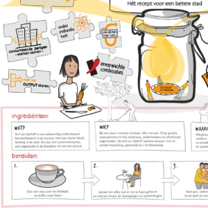
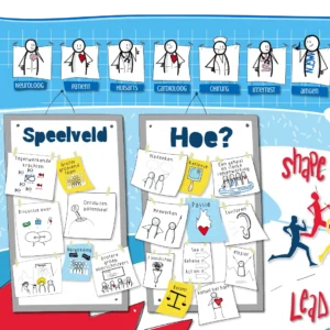
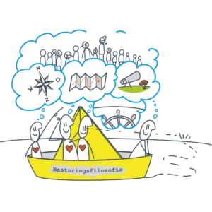
Buro BRAND is a strategic communication agency in The Hague that makes change understandable. During my internship there I mostly worked with a pen tablet in Illustrator.
My drawing skills went into helping the clients of the studio. Through visual communication I was able to turn complicated questions into understandable illustrations.
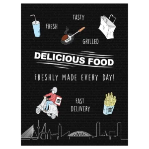
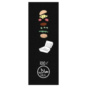
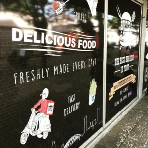
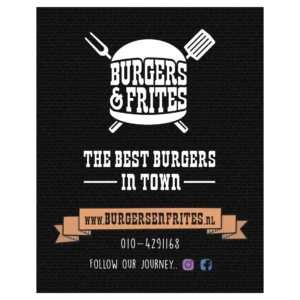
The client asked me to design window stickers for the location in Rotterdam South. The place had to become recognisable from a distance.
The illustrations I drew digitally with a pen tablet and then had printed at large format. The same drawings come back on the wrapping paper and the business card.
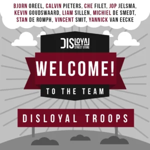
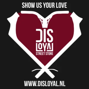
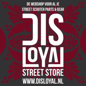
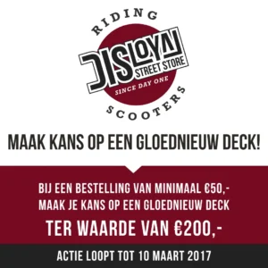
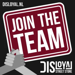
For the web shop Disloyal I designed these posts. They are meant to announce offers on their Instagram account.
The colours and the illustrations follow the identity of the brand. That makes the posts visibly part of the web shop.
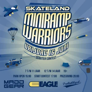
The Miniramp Warriors event was held at Skateland in 2017. To promote it I designed an announcement for social media.
The contest took place in a mini ramp, a kind of half pipe. I pictured it as a battlefield, which points back at the name of the event.
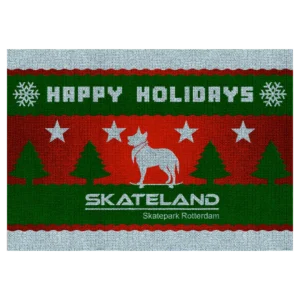
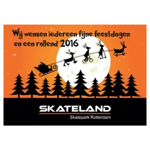
Every year the skatepark sends out Christmas cards. The designs I matched to the house colours of Skateland.
One card shows all four sports that use the park. The other shows Doekie, the dog that always walks around there loose, drawn as if the design were knitted from wool.
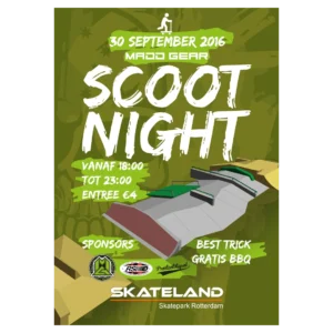
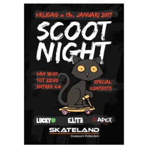
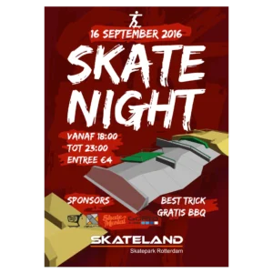
Skateland regularly held skateboard and scooter evenings. To promote them I designed a series of posters.
The colours of the Scoot Night poster follow the colour use of the main sponsor. The other shows a cat on a scooter, because that contest fell on Friday the thirteenth.